Took over the initial UI concept created by the industrial designers responsible for the vehicle's design. Refined and developed it into a clear, user-friendly touchscreen interface for the G20 vehicle. Ensured all required features were integrated while staying within strict brand guidelines and hardware limitations
What Was Broken
Inherited UI had serious usability flaws:
Poor hierarchy between key elements.
Driving speed + cutting speed missing from main screen.
Settings were unclear and confusing.
Error popups lacked consistency across screens.
Some of the features were missing.
Original UI inherited prior to redesign.
My Approach
Step 1: Knowledge Transfer
Held deep dive meetings with the industrial designer and engineers to understand the vehicle’s functions and constraints.
Step 2: UI Audit & Scope Definition
Reviewed the existing UI and listed what needed to be built from scratch or redesigned.
Mapped essential screens, interactions, and data displays.
Step 3: Collaborative Design Process
Ran multiple brainstorming sessions and design reviews with engineers, product owners, and the design team.
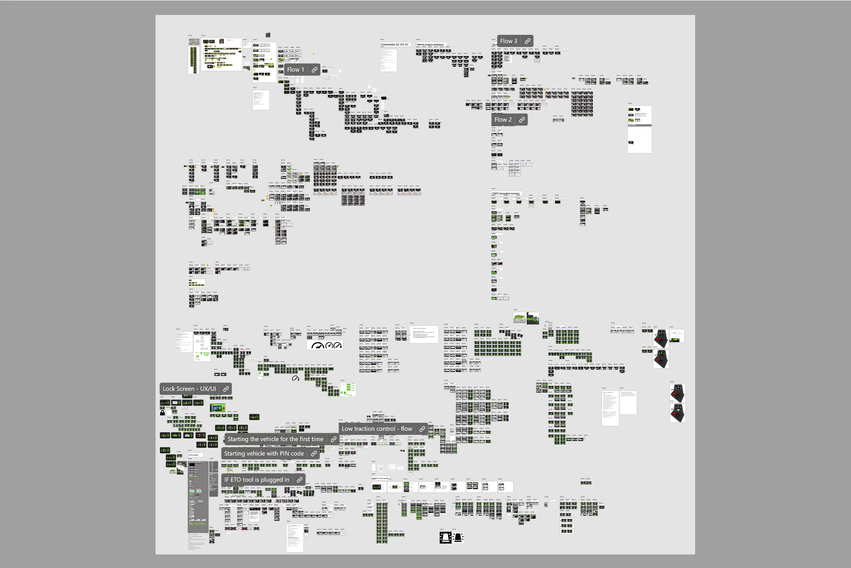
Iterated fast, made decisions quickly due to the vehicle being built simultaneously.
Step 4: Design & Validation
Finalized the UX/UI, ensuring alignment with brand guidelines, physical button layout, and screen tech limitations.
Conducted internal testing on implemented version at the office.
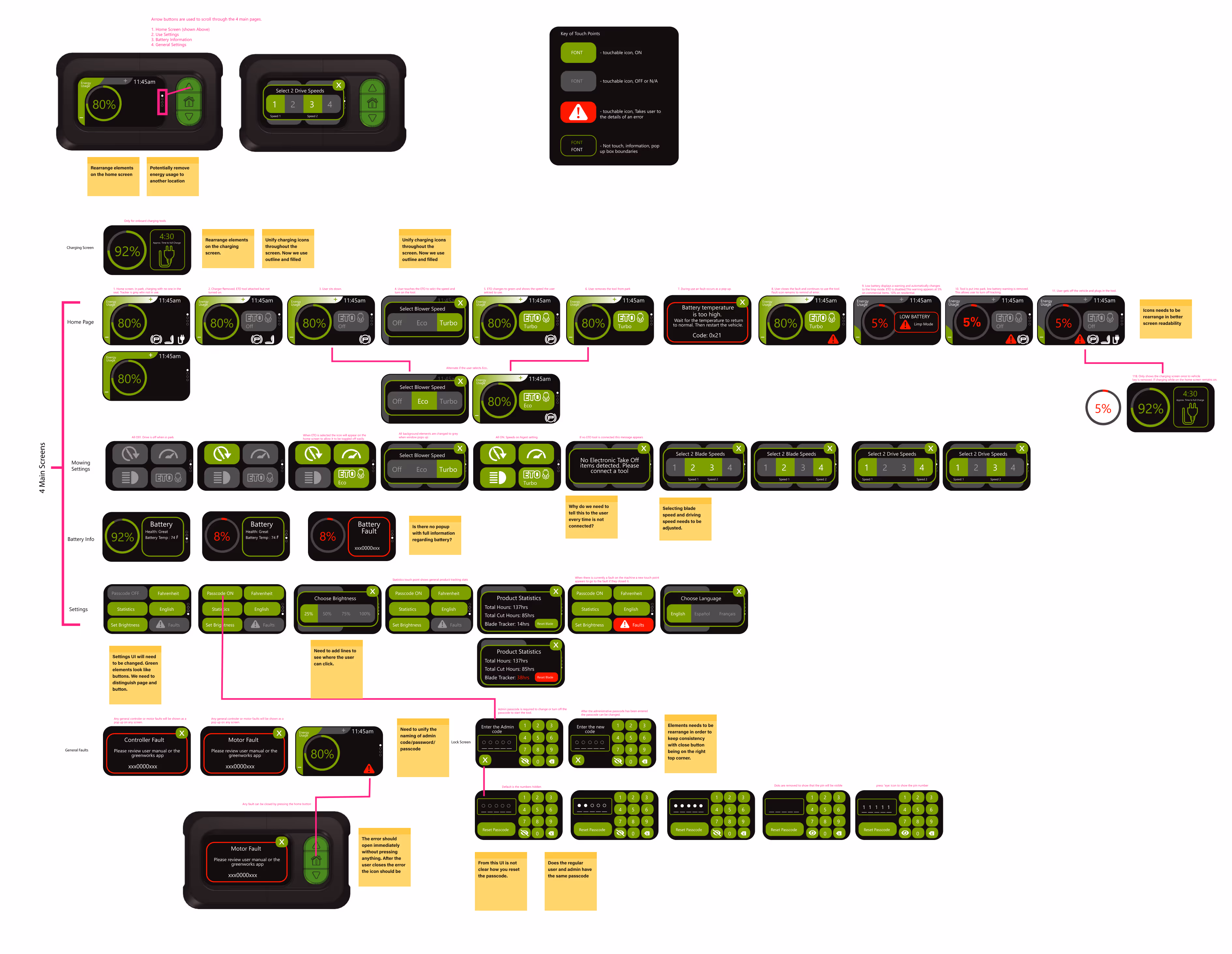
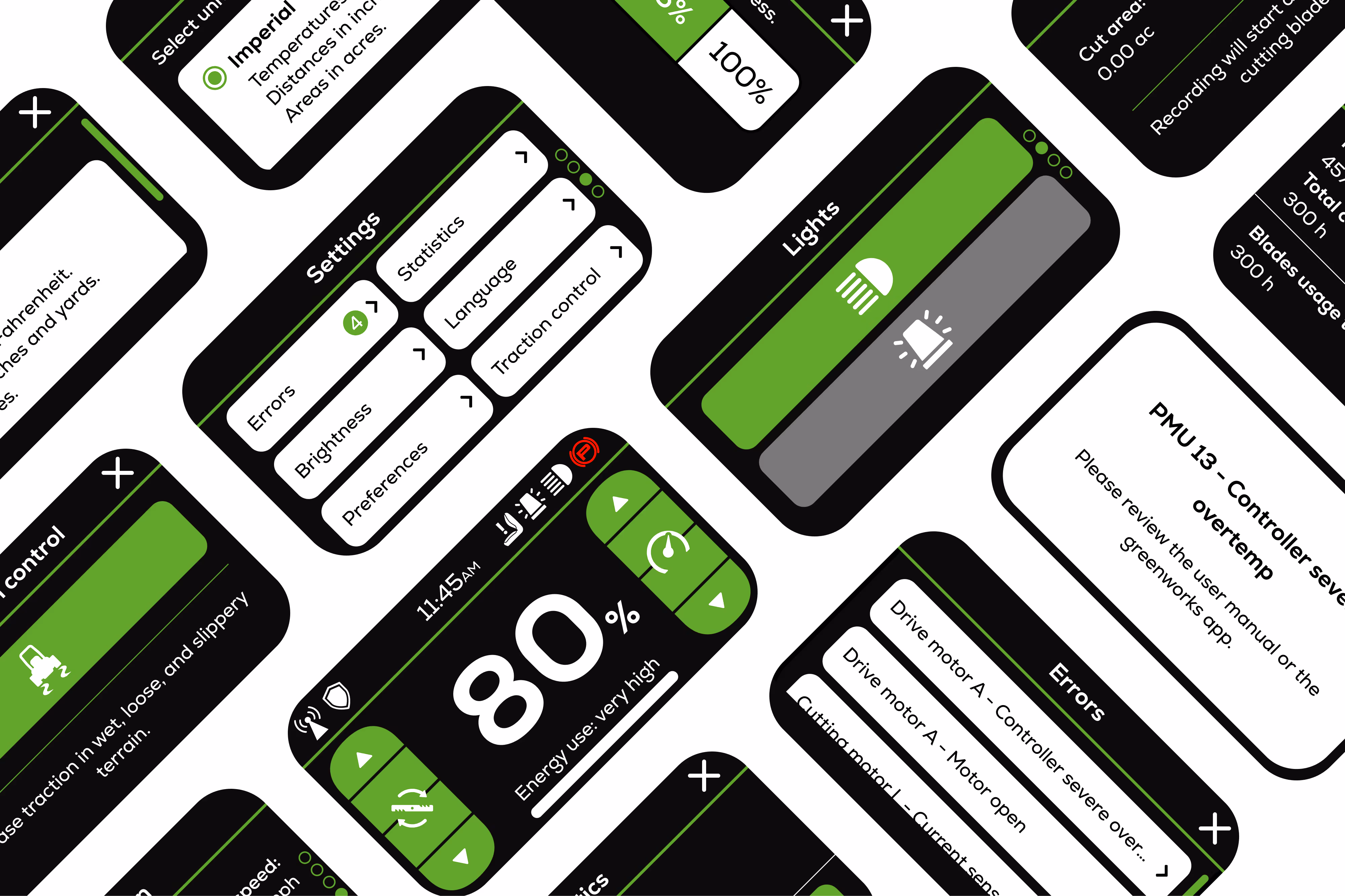
Screenshot showing iterations leading to final decision.
Design Decisions (and Why)
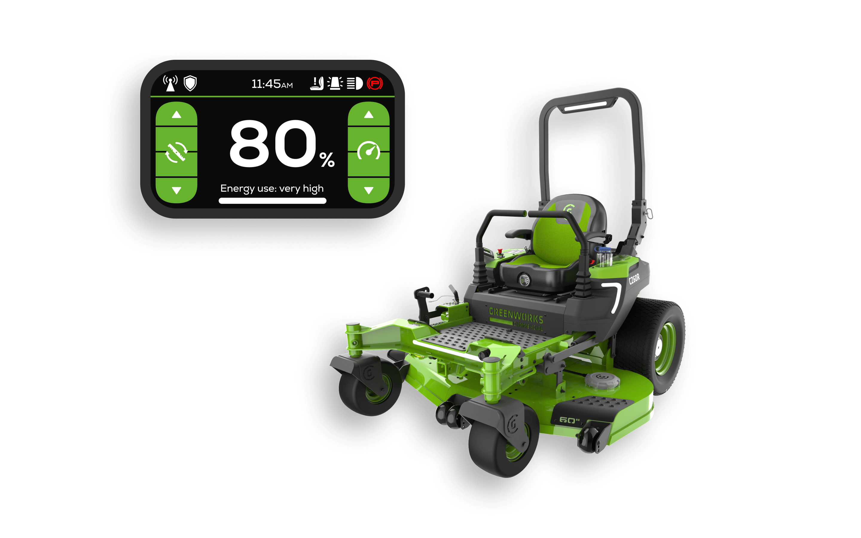
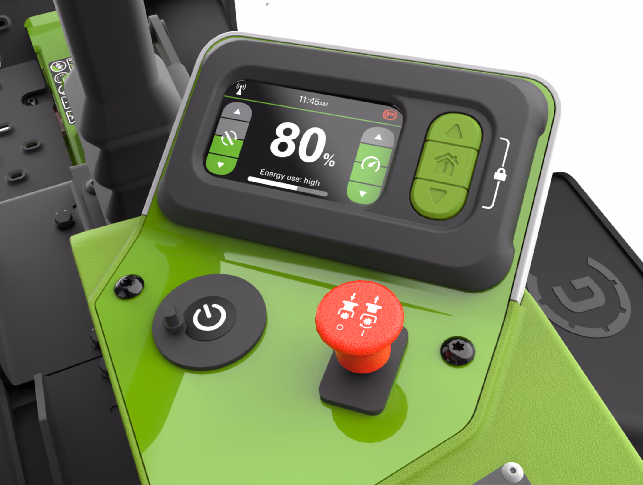
Clear Visual Hierarchy: Reorganized layout to highlight key info like driving and cutting speed.
Consistent System UI: Standardized all error messages and notification styles.
Grouped related controls by task (like info icons, speed settings, energy use) to make the interface easier to understand and use.
Adapted to Hardware Limits: Created UX flow for navigating through UI based on fixed physical button layout.
OptimusZ vehicle display mockup
Real Constraints
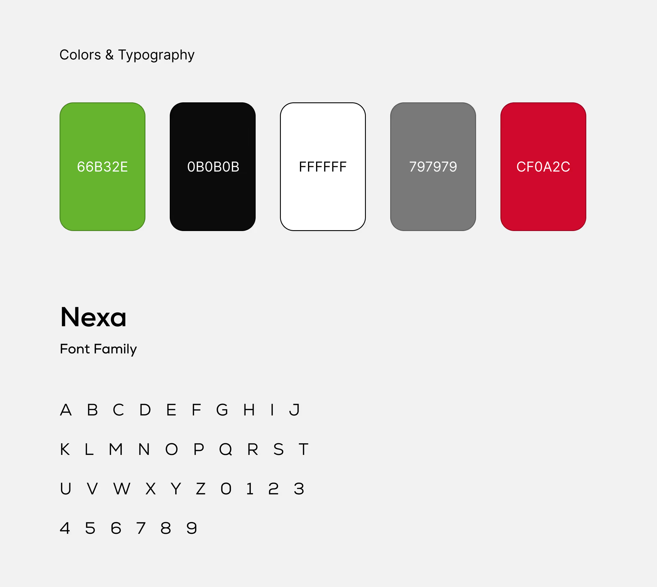
Brand Guidelines: Colors and fonts were pre-defined and non-negotiable.
Physical Buttons: Layout was already set, limiting interaction patterns.
Screen Tech: Decision was made to use touch screen technology and it couldn't be changed.
Greenworks Commercial brand colors and typeface
Key Challenge
Vehicle and Interface Built in Parallel:
The G20 vehicle was under development during design, meaning features and flows changed often.
Limited time for exploration. Designs had to be adjusted in real time as hardware and software evolved.
Outcome
Positive:
UI was easy to follow.
Design felt clean and modern.
Negative:
Touchscreen was not practical for glove use (hardware constraint outside of design control).

.svg)


.avif)