UX/UI for greenworks app that allows user to connect and control greenworks robotic lawn mowers, vehicles and more.
Roles: UX Research / Branding / Visual Design / Prototyping
Teams: UX/UI / IoT / Marketing / Robotics
Year: 2019 - 2025
Market: Europe
Project Goal
Redesign the outdated Greenworks app to improve its visual identity and user experience without changing core functionality.
What Was Broken
Outdated UI made the app feel cheap and untrustworthy.
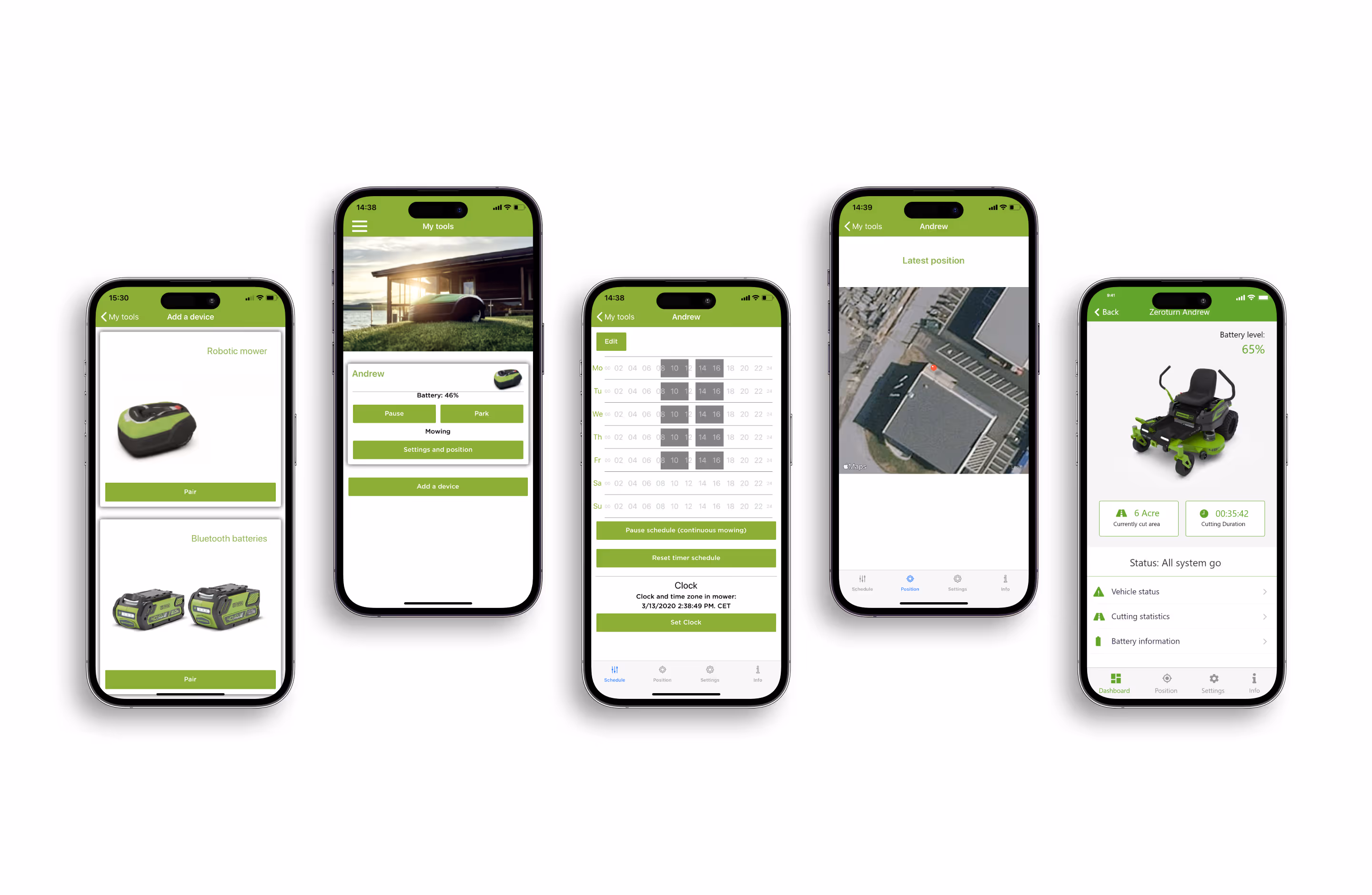
No installation guide in the app. Users had to rely on a poorly made paper manual.
The app didn’t reflect the innovation of the Greenworks brand or its smart tools.
Greenworks tools app when I started working at the company
My Approach
Step 1: Get Real User Frustration Firsthand
Asked a newly hired designer to install a robot via the app with no background info.
Observed confusion, friction, and general frustration.
From this mini usability test, we mapped key usability gaps.
Step 2: Define the Design Direction
Kept all existing features. This was a visual and UX improvement, not a feature overhaul.
Focused on a modern, clean aesthetic aligned with the Greenworks brand.
Prioritized scannability, speed, and trust in the UI.
Design Decisions (and Why)
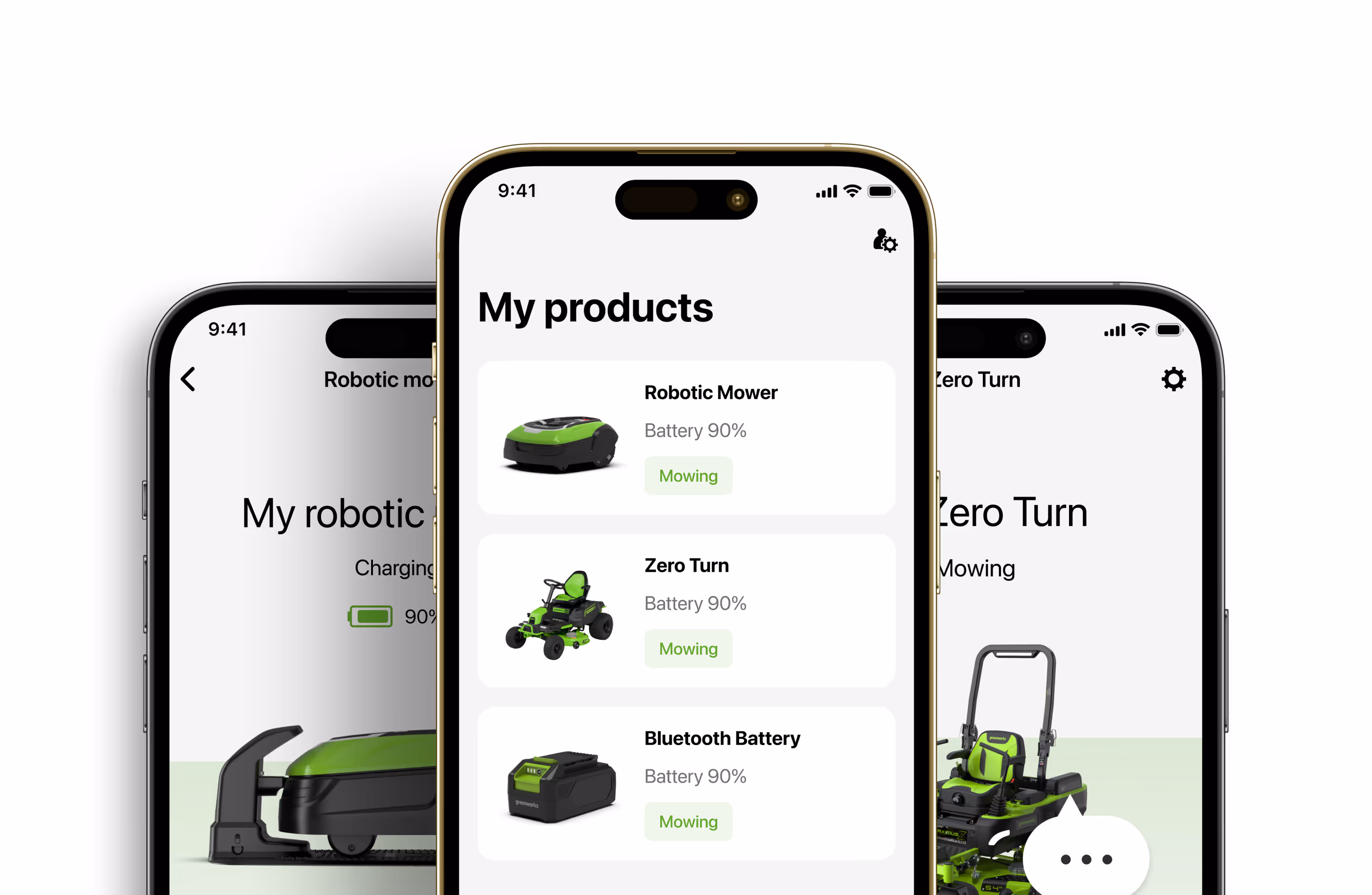
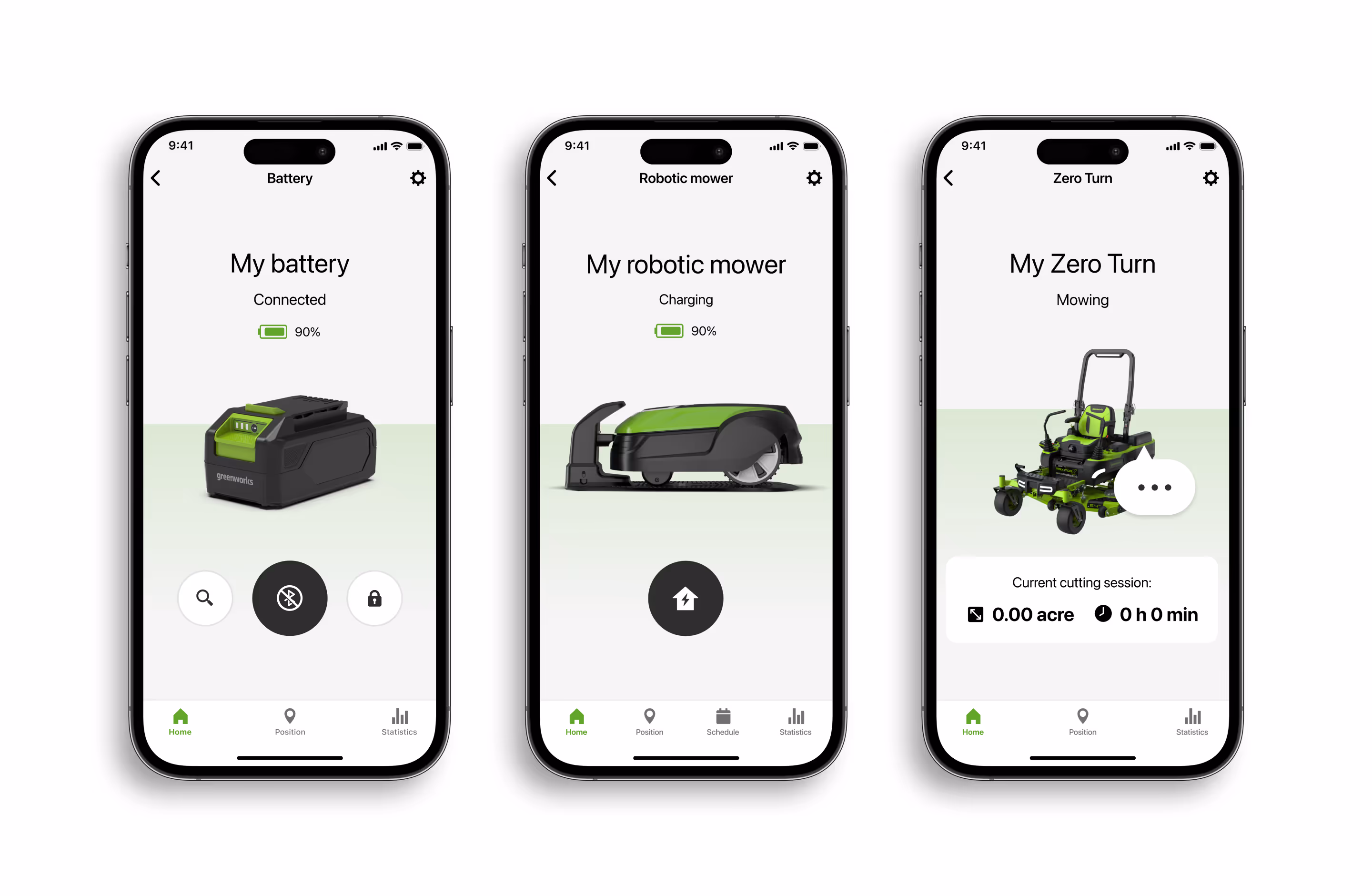
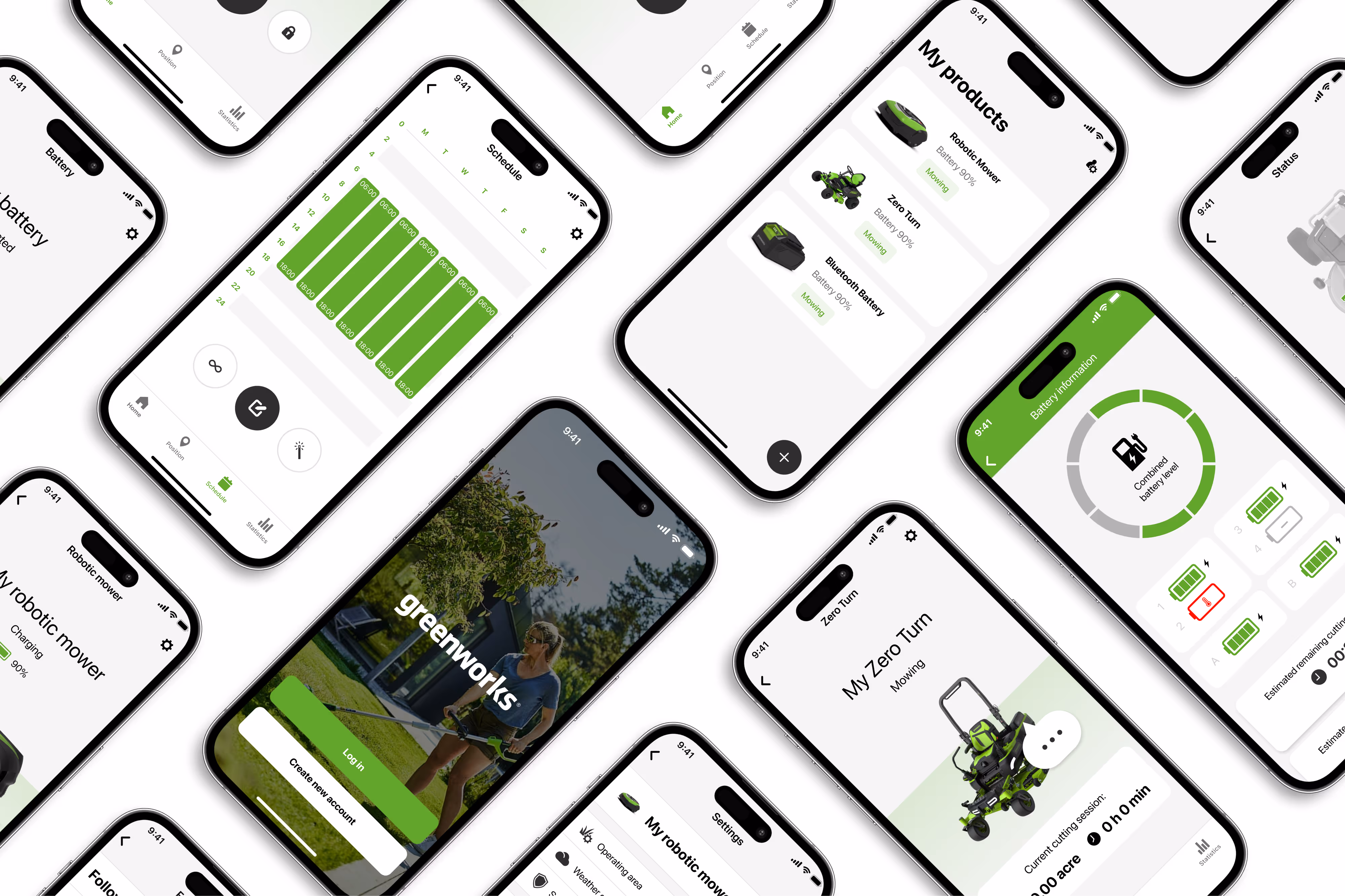
Consistent Layout: Created a unified layout between the same category products to handle many tool types without confusing users.
Integrated Installation Guide: Embedded a step-by-step guide directly into the app to reduced dependency on printed manuals.
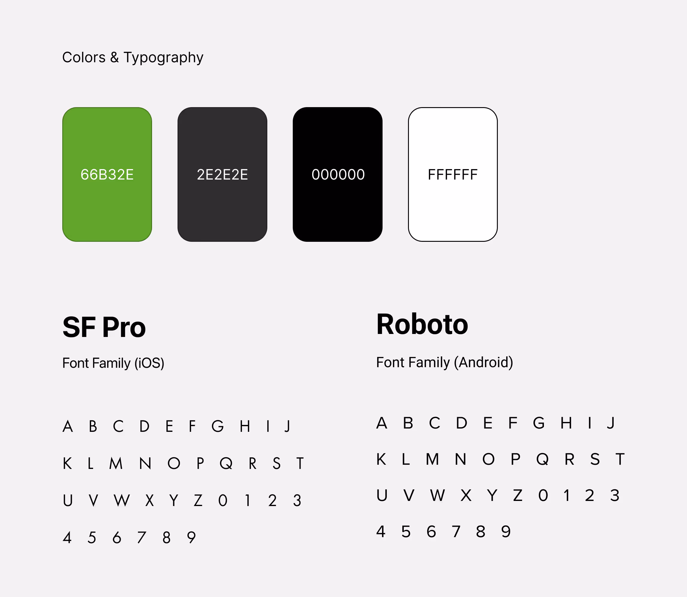
Visual Refresh: Applied the brand's green and grey palette with a minimalist aesthetic to reflect innovation and eco-tech.
Image Handling: Worked within strict image constraints. Needed to use existing image bank creatively through cropping, applying shadows, etc...
Real Constraints
Brand Guidelines: Color use was heavily restricted.
Limited Assets: Couldn’t get new product images. Had to fix the old one's to match the UI design.
Broad Product Range: One app for many tools (robots, batteries, zero turns) meant the UI needed to scale across tool types with different features.
Greenworks tools main colors and typefaces
Key Challenge
Consistency across inconsistency. Each product line had unique UI needs: different features, different usage flows, etc... Creating a consistent UX while keeping specific functionality intact was the toughest part.
Examples of different connected products
Outcome
Users reported the app felt faster, looked cleaner, and was much easier to use.
Installation complaints dropped noticeably after embedding the in app installation guide.
Internal stakeholders praised the visual transformation. Saw it as more aligned with the Greenworks brand promise.

.svg)


.avif)